Post Digital Letterpress


Last year, during Lpw 2017, Christopher Wilson asked me to take part in a prints exchange focused on his Phd research about post-digital press. I liked very much the idea so I accepted and started to think about the meaning of post-digital connected to letterpress. Erik Spiekermann is quite clear about it: the precision of digital design mixed with the quality of the old presses creates a unique and sofisticated print process. But, because I prefer to use old types, I turned the approach: is it possible to print in letterpress with the same flexibility of digital – in terms of timing and design diversity?
This question reminded me the novel Tristano, by Nanni Balestrini. All the text was a cut up experiment; every page was divided into two paragraphs, each with a beginning and an end. So, every page should be readed by itself. The book was assembled putting the pages randomly – and making every copy unique. This project is dated in the ’60 using a Xerox and reprinted in digital in 2007.
In 2018 I tried to do something like it: a print edition with the same contents, each copy slightly different designed.
The first step was to choose the contents, strange and bizzarre as the design. So, why not 42, the famous answer to the biggest question in the Galaxy?
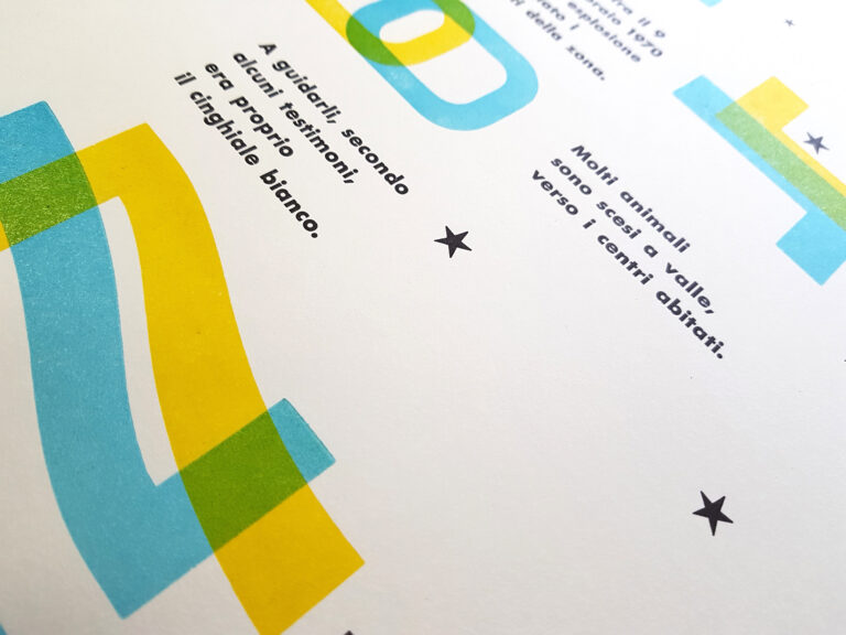
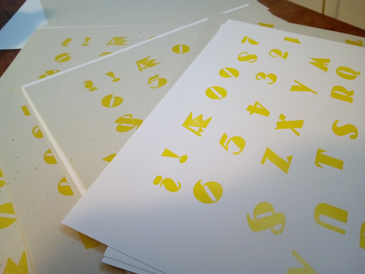
Ready to print I decided to use a curious type for the background, one of the first to enter in Novepunti’s collection: Dolmen. Its strange shapes look like a sort of an alien language, a good connection with 42.
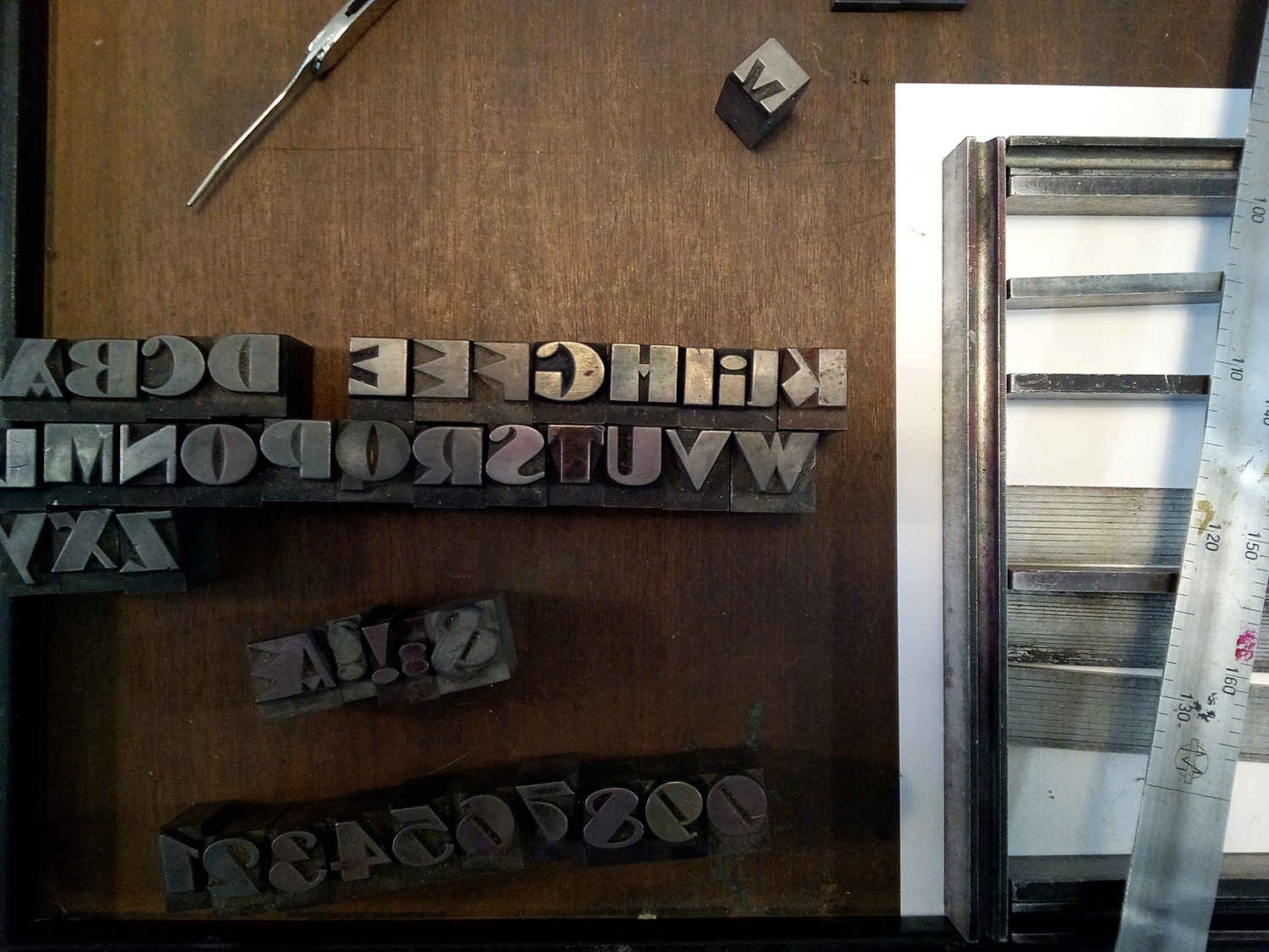
So, the first run: yellow. Every 12/15 copies I changed some letters, turning them upside down and replacing each other.
At the end, the specimen was totally mirrored. Then, using orange and mixing the sheets, I turned back everything. The result was
a bunch of prints with some slightly differences.
The same with the answer 42 but using the Heidelberg Windmill and changing the layout every 15 copies.
At the end I printed 60 different variations of the same work – and I probably could do more.
Comparing the time I spent in setting and printing (cleaning included) to the one I should spend with indesign – and printing as well, and looking at the final result, I should say that letterpress is still a good competitor to digital. Not only for the pressure.
Printed at Officina Tipografica and Typolab using Dolmen and grotesk black condensed
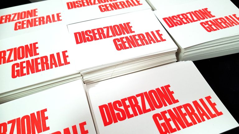
60 copies numbered
black, yellow, orange
20×20 cm