Don't stop in Conac
In mezzo al nulla, oppure in mezzo alla Francia; ecco dove sono andato lo scorso maggio. In realtà sono tornato a trovare John Spencer, uno dei pilastri di Letterpress Workers e, soprattutto, un ottimo amico.
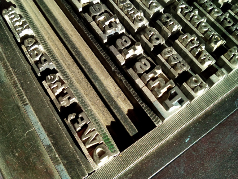
John vive a Conac, una piccola frazione di Saint Privat d’Allier, vicino a Le Puy, in un edificio di fine ottocento, usato un tempo come stalla per le pecore, e riconvertito ad abitazione e laboratorio. Tre livelli su cui si intersecano Albion e frigoriferi, cassettiere di caratteri e comodi divani, una cucina con a fianco un torchio litografico. Un fantastico micro universo che rappresenta pienamente la frugale complessità del suo creatore. La prima volta che venni, nell’estate del 2018, rimasi folgorato, sembrava di essere in una sorta di film di Tim Burton ma senza la drammaticità e lo spirito gotico. Tutto collocato nella cornice di una campagna francese poco conosciuta e molto simile, come approccio contadino, ad altri posti a me familiari. Il motivo della seconda visita è stato più professionale. Mentre la prima volta, per me e Chiara, la mia compagna, si è trattata di una vera e propria vacanza, questa seconda breve permanenza era finalizzata (anche) al provare a fare una breve residenza d’artista. Per questo non eravamo da soli: oltre a noi, sono venuti anche Guillaume Beautemps (altro amico di Lpw) e la sua compagna Marionne. Insieme abbiamo sperimentato, per la prima volta, la stampa litografica. Avendo visto altre volte torchi a stella e pietre d’incisione, ero convinto che fosse una faccenda relativamente immediata. Non dico semplice ma, comunque, molto vicina alla stampa tipografica. Basta inchiostrare la pietra (incidendola in qualche modo a me ignoto), appoggiarci il foglio e far passare tutto sotto il rullo di pressione. Invece si è rivelato un affare piuttosto complesso, dove la pressione c’entra ma fino a un certo punto. Ed entra in ballo la chimica.
Infatti, il processo di stampa è basato su un continuo mettere e togliere acidi, polveri, inchiostri, sempre stando attenti a non sporcare la pietra. Si avverte una certa storicità durante i passaggi (forse dovuta al fatto che è un tipo di stampa molto usata dagli artisti) e l’attenzione che si mette nell’utilizzo degli elementi chimici (per evitare di corrodersi le mani) fa venire in mente la pratica alchemica. In effetti, grazie all’esperienza di John, se non proprio la pietra filosofale, qualcosa di buono lo abbiamo tirato fuori. La parte di incisione della pietra, che consiste nel “disegnarci” sopra con pastelli a cera, lapis o pennelli inchiostrati, è stata rapida, più lento è stato decidere cosa metterci. Volendo sperimentare le differenze cromatiche che si ottengono con i diversi strumenti, ho pensato potesse essere interessante riportare una sorta della mappa della zona, evidenziando i punti di maggior interesse. Non mi aspettavo però che uscisse una sorta di cavaliere fantasma!
Questa apparizione si è rivelata utile suggerendo cosa scrivere con i caratteri mobili (utilizzando un fantastico tirabozze Farley): un mezzo monito per gli incauti visitatori. O, almeno, per i viandanti del vicino cammino di Santiago. Guillaume si è rivelato, al contrario mio, estremamente prolifico e ha prodotto una piccola serie di varianti tipografiche, passando dal Gill Sans ad alcune grosse lettere graziate.
Alla fine quello che è uscito è stato un interessante portfolio, spero anticipo di tanto altro.
à bientôt!


In the middle of nowhere, or in the middle of France; that’s where I spent some days last May. I actually went back to see John Spencer, one of the pillars of Letterpress Workers and, above all, a good friend.
John lives in Conac, a small hamlet of Saint Privat d’Allier, near Le Puy, in a late 19th century building, once used as a stable for sheep, now converted into a home and laboratory. Three levels on which intersect Albion presses and refrigerators, drawers of types and comfortable sofas, a kitchen with a lithographic press next to it. A fantastic micro universe that fully represents the frugal complexity of its creator.
The first time I came, in the summer of 2018, I was struck, it seemed to be in the cheerful version of a Tim Burton’s movie, all set in a little-known French countryside very similar, in the spirit, to other places I love. The reason for the second visit was more professional. While the first time, for me and Chiara, my partner, it was a real holiday, this second short stay was (also) aimed at trying to make a short artist’s residence. That’s why we weren’t alone: in addition to us, Guillaume Beautemps (another friend of Lpw) and his partner Marionne also came. Together we experimented, for the first time, with lithographic printing. Having seen star presses and engraving stones at other times, I was convinced that it was a relatively immediate matter. Not simple but, in any case, very close to typographic printing. It’s enough to ink the stone (engraving it in some way unknown to me), put the sheet on it and let everything pass under the pressure rolls. Instead, it turned out to be a rather complex affair, where the pressure has to do with it but up to a certain point. And chemistry comes into play.
In fact, the printing process is based on a continuous putting and removing of acids, dust, inks, always being careful not to dirty the stone. There is a certain historicity during the passages (perhaps due to the fact that it is a type of printing widely used by artists) and the attention that is paid to the use of chemical elements (to avoid corroding the hands) brings to mind the alchemical practice.
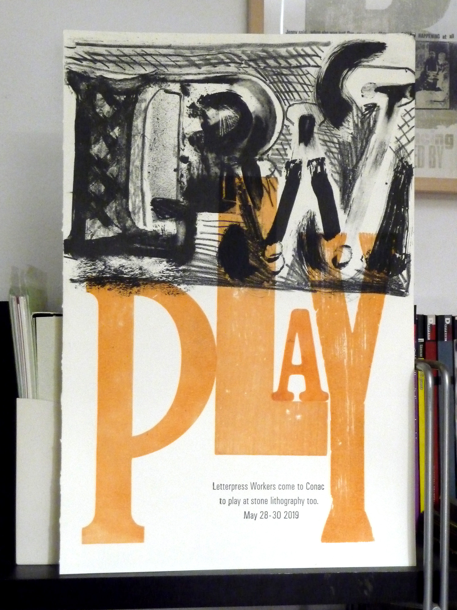
In fact, thanks to John’s experience, if not the Philosopher’s Stone, we pulled something good out of it. The engraving part of the stone, which consists of “drawing” on it with wax crayons, lapis or inked brushes, was quick, the slower it was to decide what to put in. Wanting to experience the chromatic differences obtained with the different tools, I thought it might be interesting to report a sort of map of the area, highlighting the points of interest. But I didn’t expect a sort of ghost knight to come out!
This appearance proved useful in suggesting what to write with types (using a fantastic Farley press): a half a warning to unwary visitors. Or, at least, for the wayfarers on the nearby Way to Santiago.
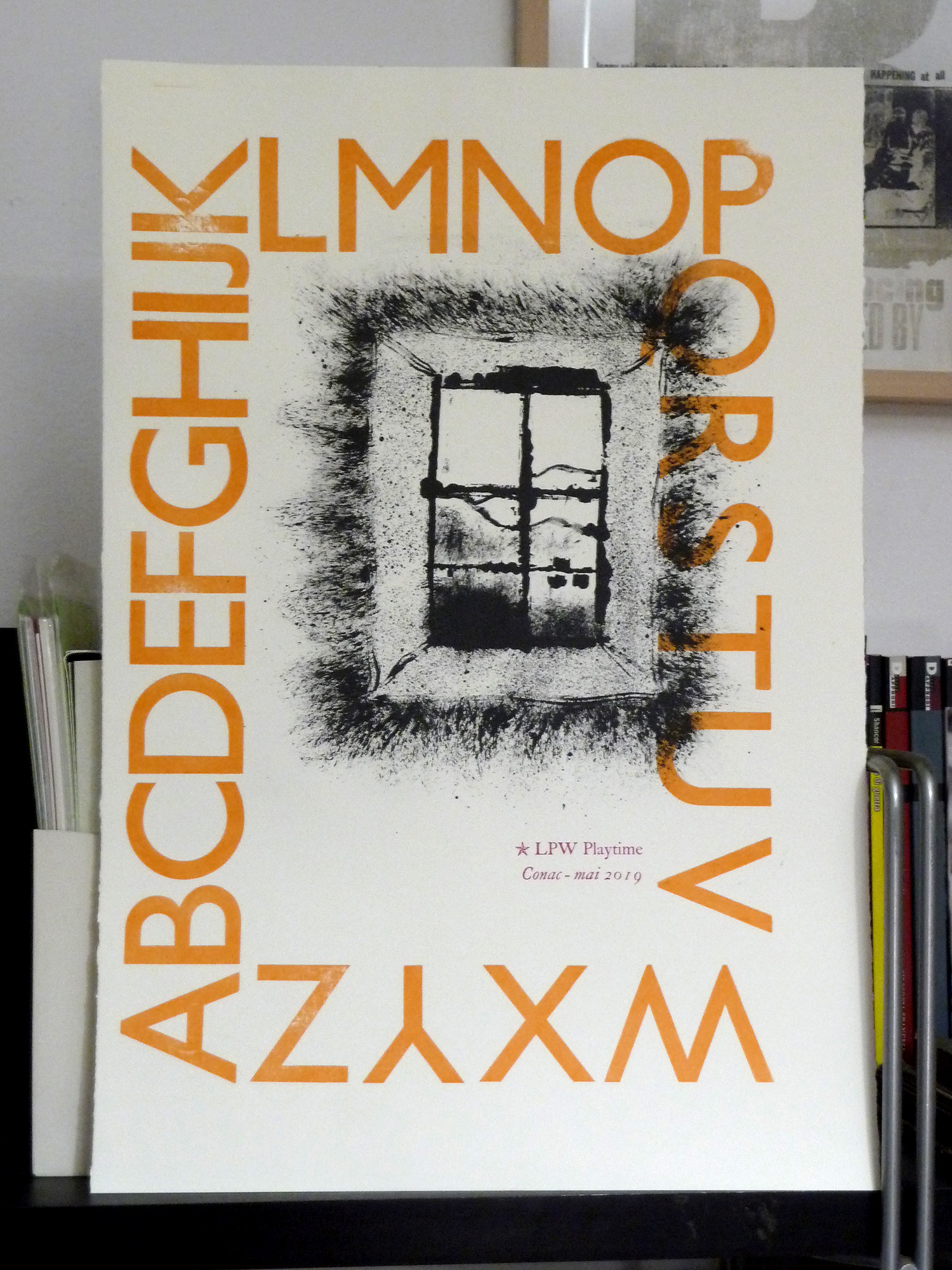
Guillaume has proved, unlike me, extremely prolific and has produced a small series of typographical variations, passing from Gill Sans to some really large serifs.
In the end what came out was an interesting portfolio, I hope a taste of much more.