First Think Second Print
Durante lo scorso Milano Graphic Festival, insieme a Fabrizio Falcone, ho tenuto, dopo parecchio tempo, un laboratorio di stampa. Era da alcuni anni, da molto prima del Covid, che non ne facevo più ed è stata un’esperienza interessante, soprattutto per il fatto di avere carta bianca e poter decidere cosa e come farlo. Insieme a Fabrizio abbiamo stabilito l’ascisse (il carattere tipografico) e l’ordinata (il contenuto) in modo che potessero alimentare un processo utile ai partecipanti.
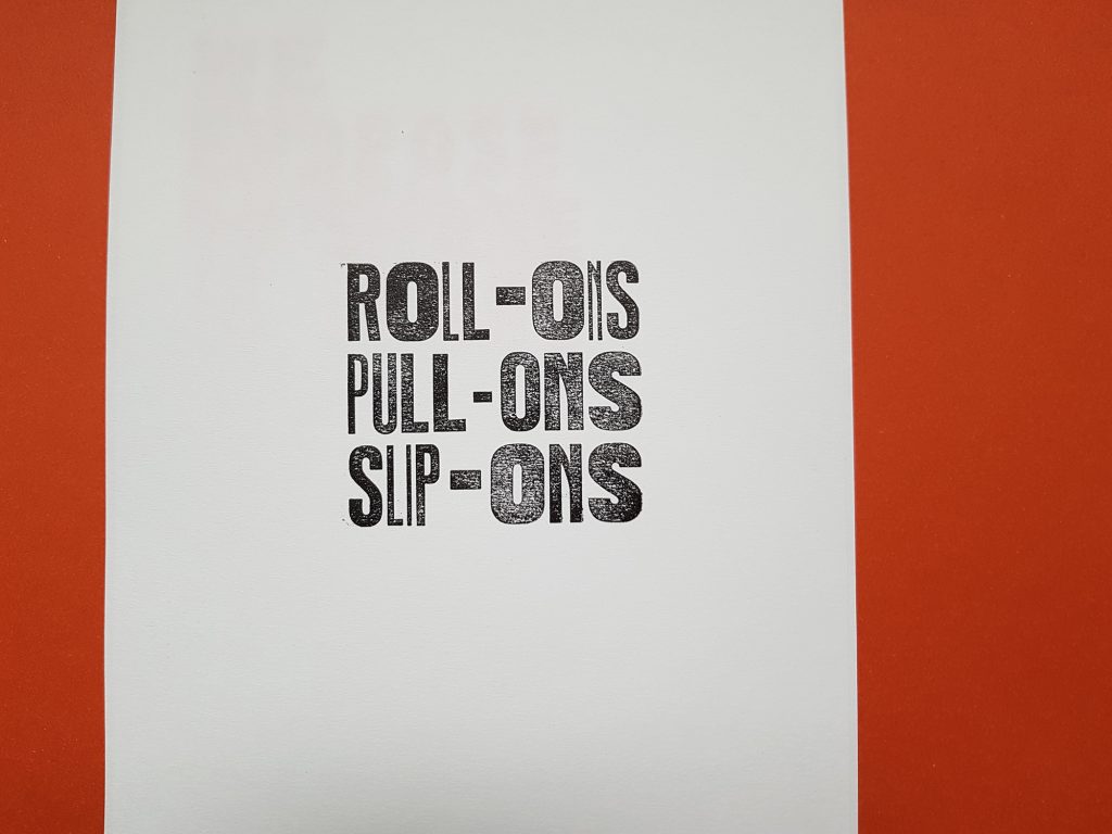
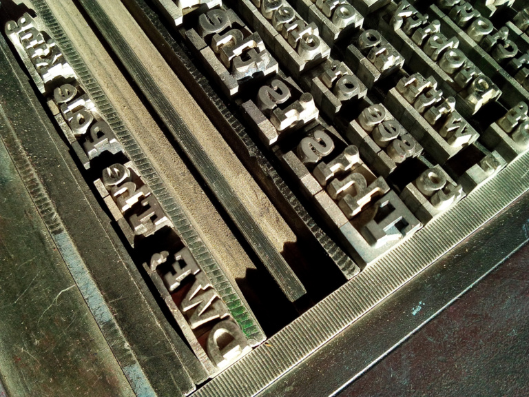
Due cassette di legno hanno stabilito i caratteri da usare: un bastone non ancora identificato e l’Aurora. Disegnato in Germania agli inizi del XX secolo, l’Aurora è passato attraverso un’infinità di fonderie (qui una panoramica completa), cambiando continuamente nome, per approdare in Italia presso la Xilografia di Verona. Punto interessante perché, anziché essere prodotto in piombo, venne realizzato in legno o materiale plastico, entrando nei banconi di buona parte delle tipografie esistenti. Entrambe le cassette contengono vari pesi dei due caratteri e l’Aurora ne ha addirittura sei, tutti dello stesso corpo. Una buona occasione per poter sperimentare fisicamente il concetto di variable font!
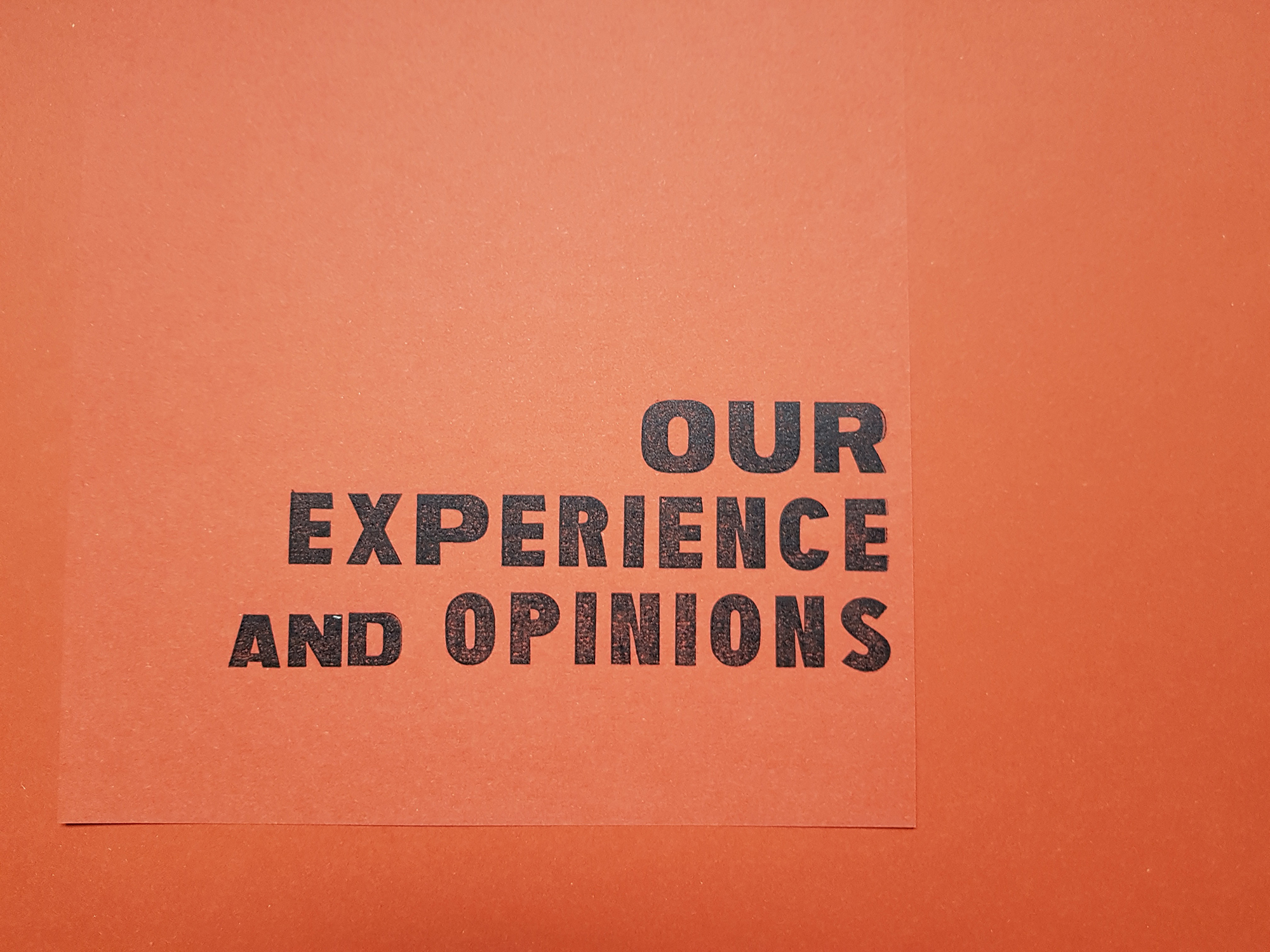
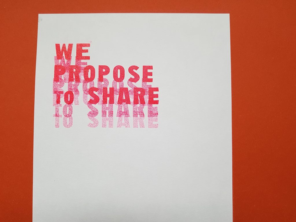
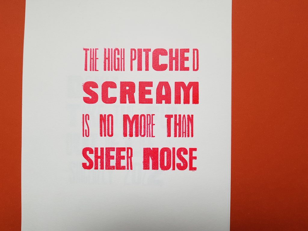
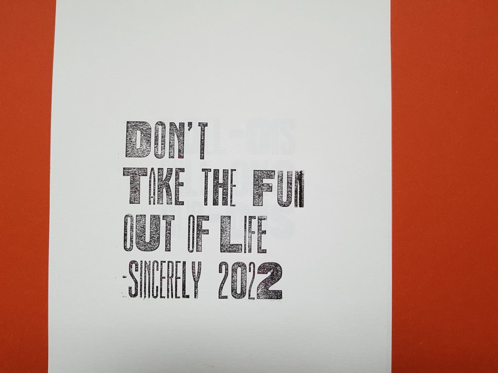
Il secondo asse è stato il contenuto. L’idea era quella di fornire un testo che parlasse di graphic design con un’accezione sociale. In circolazione ce ne sono parecchi, ma First Things First, scritto da Ken Garland nel 1963, è sicuramente il più interessante e il più importante da far conoscere e il format del workshop rappresenta un’ottima occasione per alimentare il senso civile delle persone. Il manifesto è stato quindi utilizzato come matrice da cui estrarre dei brevi cut up testuali. Senza la necessità di realizzare delle stampe di forte impatto visivo o comunicativo (in sei ore non si può pretendere troppo), quello che ci interessava di più era il processo, dalla ricerca dei contenuti alla loro produzione con strumenti “limitati”. Avvicinandoci così all’intento di First Things First: quello di far pensare a cosa, perché e come si progetta. Prima pensa, poi stampa.
During the last Milano Graphic Festival, together with Fabrizio Falcone I held a letterpress workshop after a long time. I hadn’t done one for a few years, long before Covid, and it was an interesting experience, especially because we had carte blanche to decide what and how to do it. Together with Fabrizio we established the abscissae (the typeface) and the ordinate (the content) so that they could feed into a useful process for the participants.
Two wooden boxes decided the typefaces to be used: an as yet unidentified grotesk and Aurora. Designed in Germany at the beginning of the 20th century, the Aurora passed through an infinite number of foundries (here is a complete overview), constantly changing its name, to arrive in Italy at the Xilografia di Verona. This is an interesting point because, instead of being melted, it was cutted in wood or plastic material, entering in the cabinets of most of the existing printshop in Italy. Both boxes contain various weights of the two each and the Aurora has as many as six, all of the same size. A good opportunity to physically experiment with the concept of variable fonts!
The second axis was the content. The idea was to provide a text that spoke of graphic design with a social meaning. There are a lot of them out there, but First Things First, written by Ken Garland in 1963, is certainly the most interesting and the most important to make known, and the format of the workshop is an excellent opportunity to nurture people’s civic sense. The poster was therefore used as a matrix from which to extract short textual cut-ups. Without the need to make prints with a strong visual or communicative impact (at least six hours are not so much time), what interested us most was the process, from the research of the contents to their production with “limited” tools. This brought us closer to the aim of First Things First: to make people think about what, why and how they design. Think first, then print.