Lettere anarchiche
Una nuova collaborazione con Edizioni Malamente (dopo la Breve storia dei gas lacrimogeni). Stavolta l’occasione si è presentata per l’uscita del Dizionario anarchico per bambini e bambine, una piccola e divertente cassetta degli attrezzi, utile per imparare a mettersi in gioco e a entrare in relazione con gli altri.
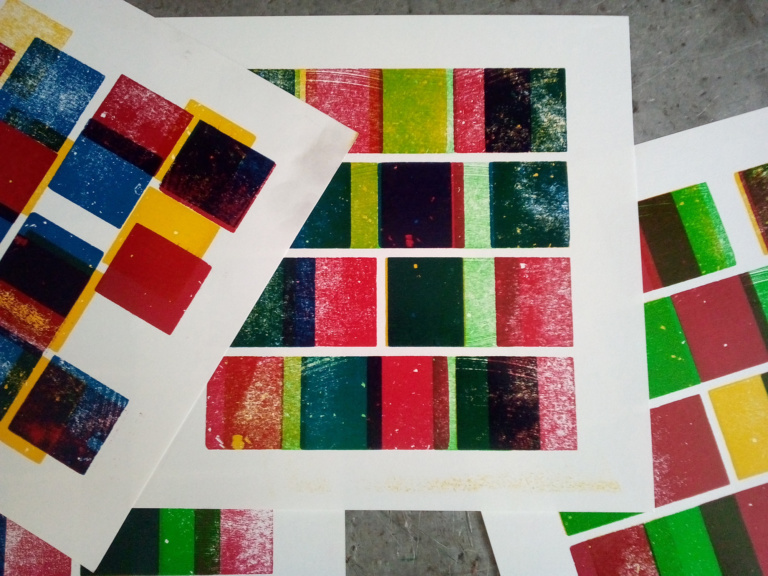
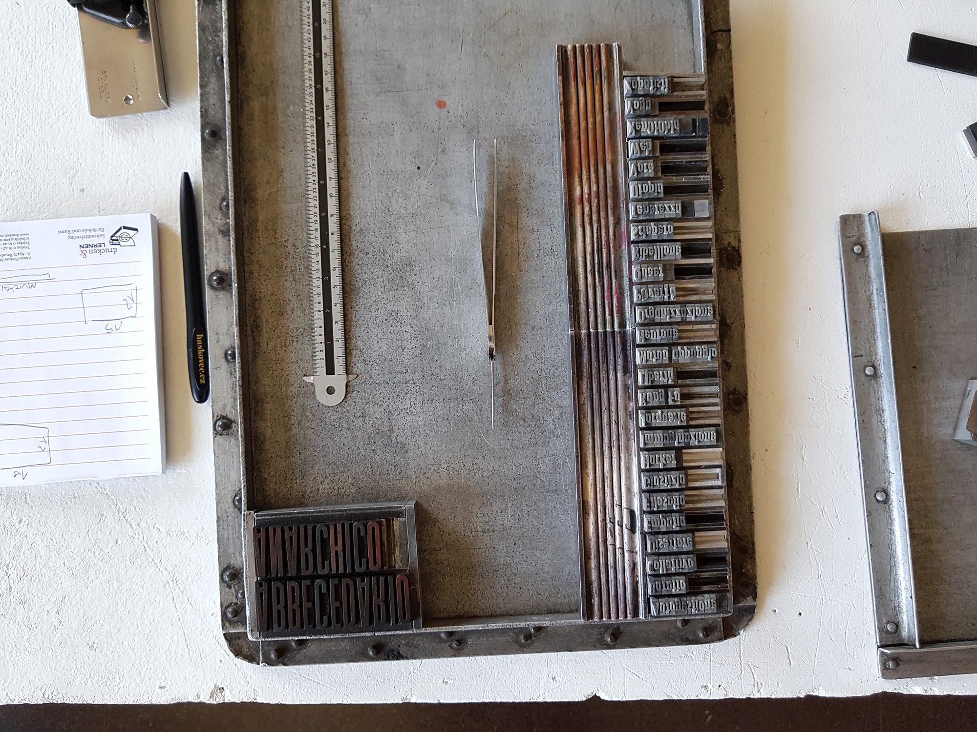
Proprio pensando ai termini presenti come strumenti, ho immaginato un poster che fosse complementare, uno strumento esso stesso in grado di parlare sia con la pubblicazione che con i lettori. Al posto di enfatizzare una sola parola, estrapolandola dal suo contesto più ampio, perché non utilizzarle tutte? Perché non fare un abbecedario?
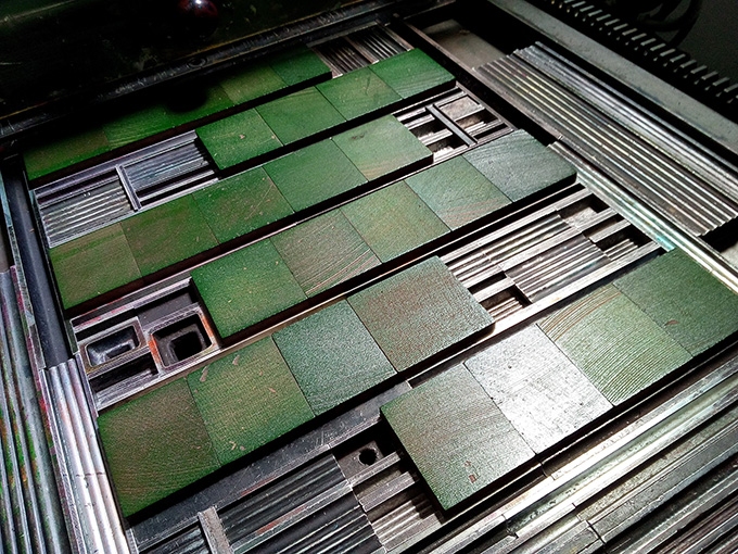
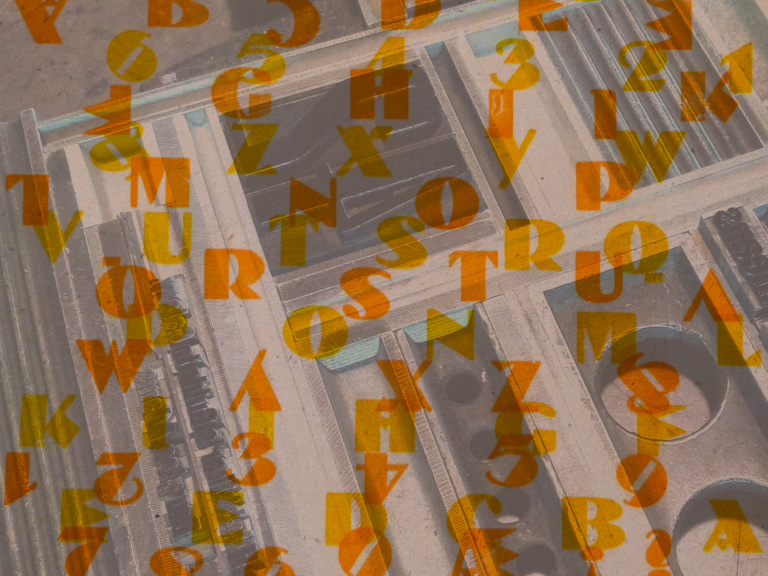
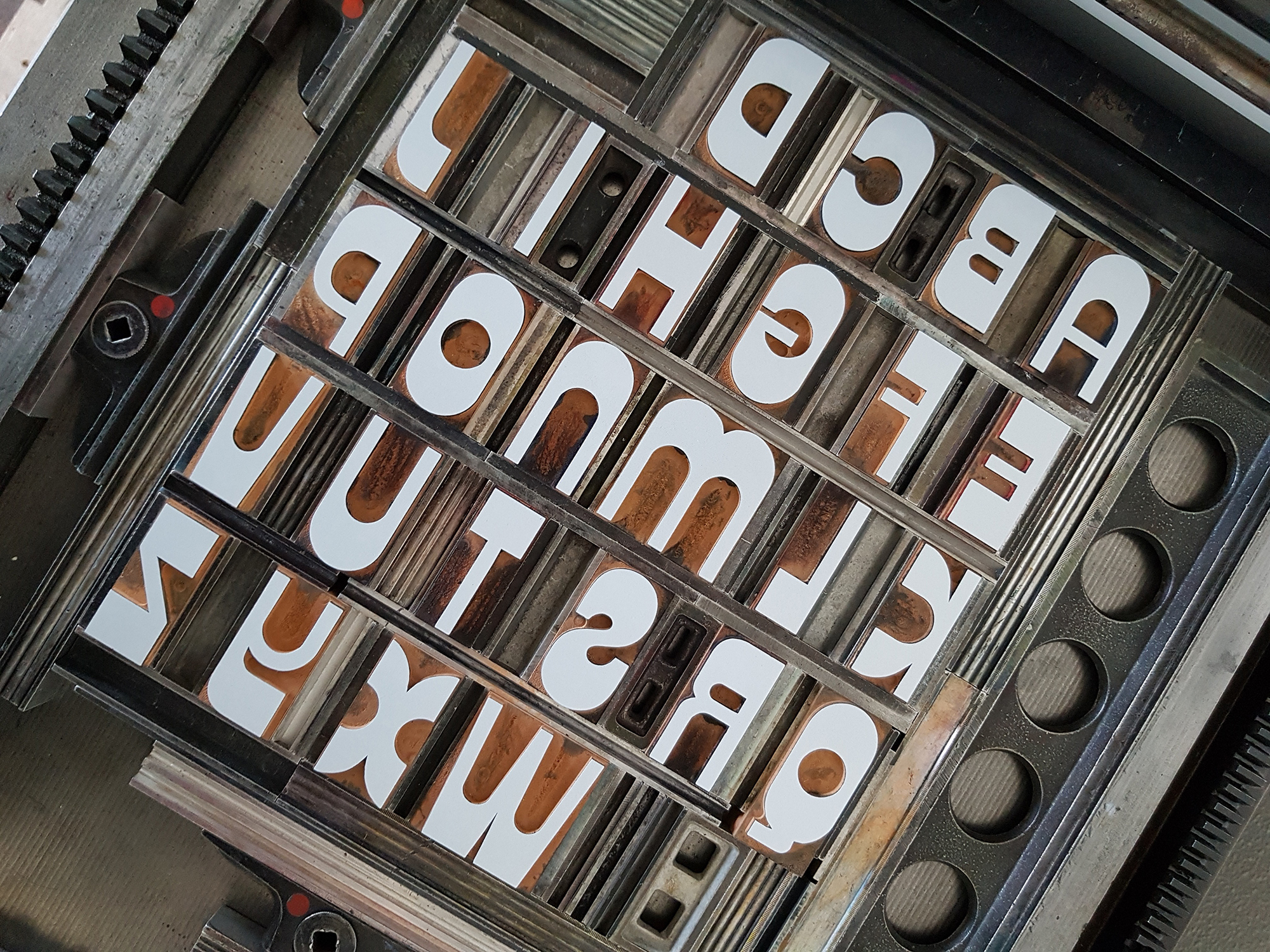
In aiuto mi venuta un’acquisizione recente, lo Zipper. Era da un po’ che volevo provarlo, curioso di vedere come usciva quello che, con il nome Delfino, è stato probabilmente una delle ultime produzioni della Xilografia Adige. L’ho sempre trovato un carattere interessante, quasi antistorico con quell’aspetto da fantascienza anni ’70, e una sorta di specimen completo (quello che è un po’ l’abbecedario) mi è sembrato il modo migliore di testarlo.
Quando poi è stato i momento del colore nero (con un bel Futura Condensed), ho iniziato a ragionare su come farlo interagire ulteriormente con i lettori. Ed ecco l’idea: un secondo poster solo con le definizioni, su cui far disegnare le lettere ai bambini (o agli adulti) in modo da creare un dittico.
Per questo i poster sono venduti insieme. Chi li prende, poi, deciderà se tenerli a fianco oppure no.
New collaboration with Edizioni Malamente (after the Breve storia dei gas lacrimogeni). This time the occasion arose for the release of the italian version of the Anarchist Dictionary for Girls and Boys, a small and amusing toolbox, useful for learning how to get involved and relate to others.
Thinking of the terms present as tools, I imagined a poster that would be complementary, a tool itself able to speak to both the publication and the readers. Instead of focusing on a single word, taking it out of its broader context, why not use them all? Why not make a spelling book?
A new typeface, Zipper, came to my aid. I had been wanting to try it out for a while, curious to see how, with the name Delfino, one of the last productions of Xilografia Adige came out. I always found it an interesting, almost anti-historical typeface with that ’70s Sci-Fi look, and a sort of complete specimen (what a spelling book is, more or less) seemed the best way to test it.
When it was time for the black colour (with a nice Futura Condensed), I started to think about how to make it interact further with the readers. And here’s the idea: a second poster with definitions only, on which children (or adults) can draw letters to create a diptych.
That is why the posters are sold together. Whoever gets them will then decide whether to keep them side by side or not.

45 copie numerate/copies numbered
- 30×40 cm
- Tre colori
- carta Fedrigoni Materica Gesso 180 g + Coriandoli 120 g
Il poster è disponibile sul sito di Edizioni Malamente/The poster is available on Edizioni Malamente website.