Chiaro & illeggibile
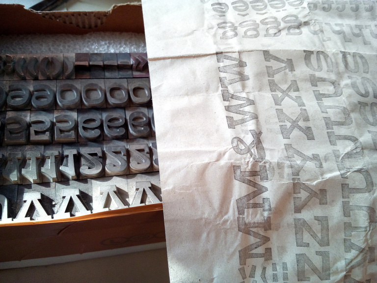
Chiunque si occupi di stampa a caratteri mobili si è sicuramente imbattuto nell’Aurora. Di origine tedesca – la prima versione risale al 1911 per la fonderia Wagner & Schmidt – si è diffuso nel corso del XX secolo in tutto il continente europeo prediligendo, a quanto sembra, proprio l’Italia. Su licenza o, semplicemente, copiato, è stato prodotto dalla Fondografica intorno agli anni ’20 e, probabilmente a partire dallo stesso periodo, dalla Xilografia di Verona, in una infinità di pesi e corpi. Anche i nomi che ha assunto nel corso degli anni sono notevoli: da Inserat Grotesk schmal a Goliath, Imperator e Sirius. Quest’ultimo, prodotto dalla Schriftguss di Lipsia, si accompagnava ad altre due varianti, Orion e Pallas, che insieme costituivano una piccola costellazione tipografica.
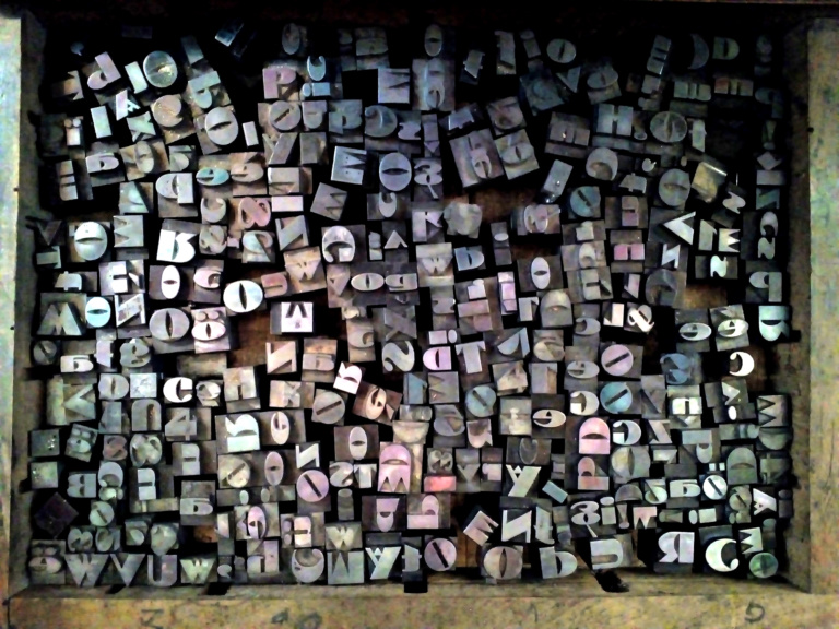
Come dicevo l’Italia è stata la sua patria adottiva. Ogni tipografia, piccola o grande che fosse, custodiva nei suoi cassetti qualche polizza di Aurora, quasi sempre in legno. Corpi strettissimi o larghi, slanciati come missili o austeri come degli annunci funebri. Le versioni sono innumerevoli e si moltiplicarono con la fotocomposizione e la successiva digitalizzazione. Non è raro, infatti, vedere l’Aurora usato nelle insegne di piccoli negozi.
La Xilografia di Verona aveva fatto anche delle versioni in plastica, probabilmente verso la fine dell’era tipografica.
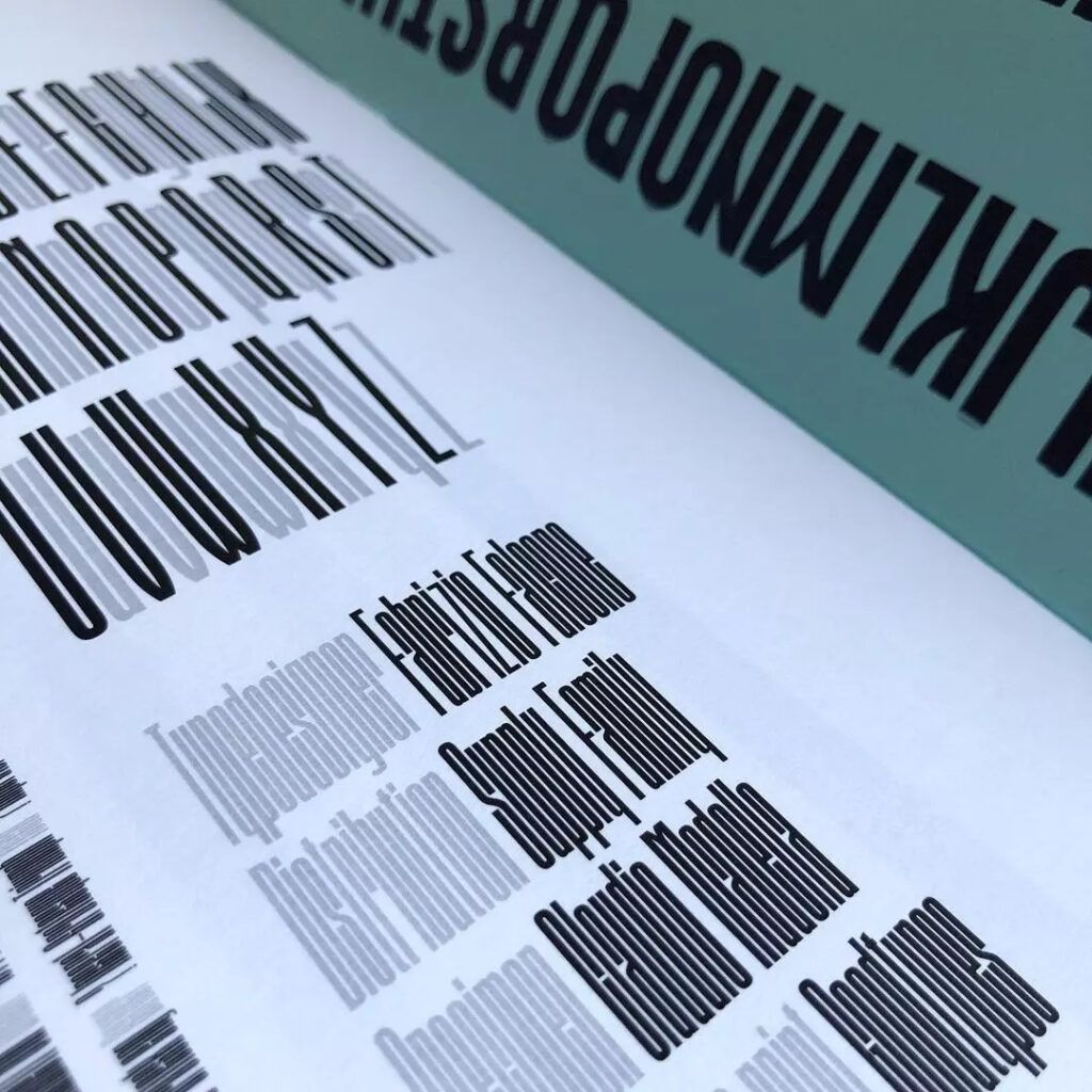
Alla famiglia, ora, si è aggiunto anche il Galaxy. Il suo primo utilizzo – in realtà il motivo della sua nascita – è stato il libro del 2021 di Letterpress Workers. In quell’occasione Fabrizio Falcone, con cui stavo facendo il libro, realizzò alcune lettere ad hoc per la busta contenitore, alte quanto la busta stessa. Da buon type designer continuò nel progetto, realizzando l’intero alfabeto, completo di numeri e di alcuni segni d’interpunzione, realizzando infine la font. Quando fu il momento di decidere il nome mi vennero in mente le declinazioni stellari della Schriftguss e gli suggerii di chiamarlo Galaxy, a rappresentare la completezza della famiglia e il suo lancio nel futuro. In cambio, mi chiese di progettarne lo specimen, contenuto e progetto.
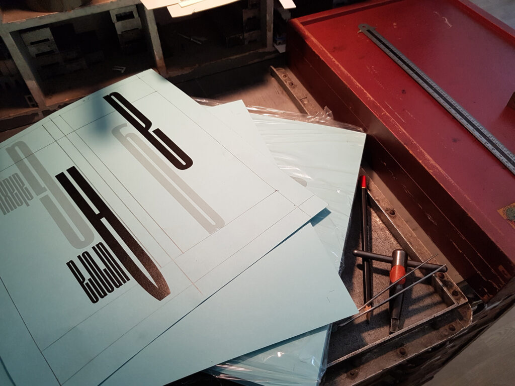
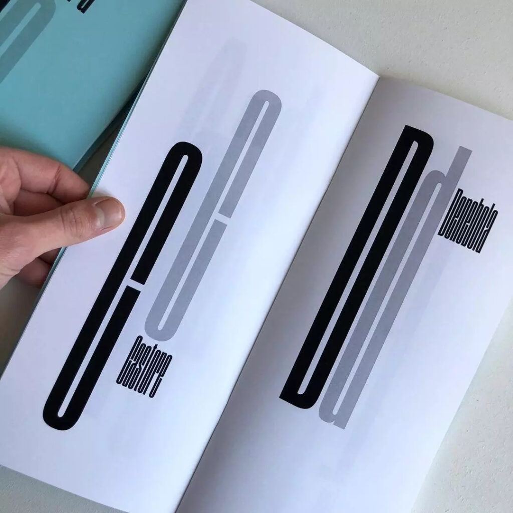
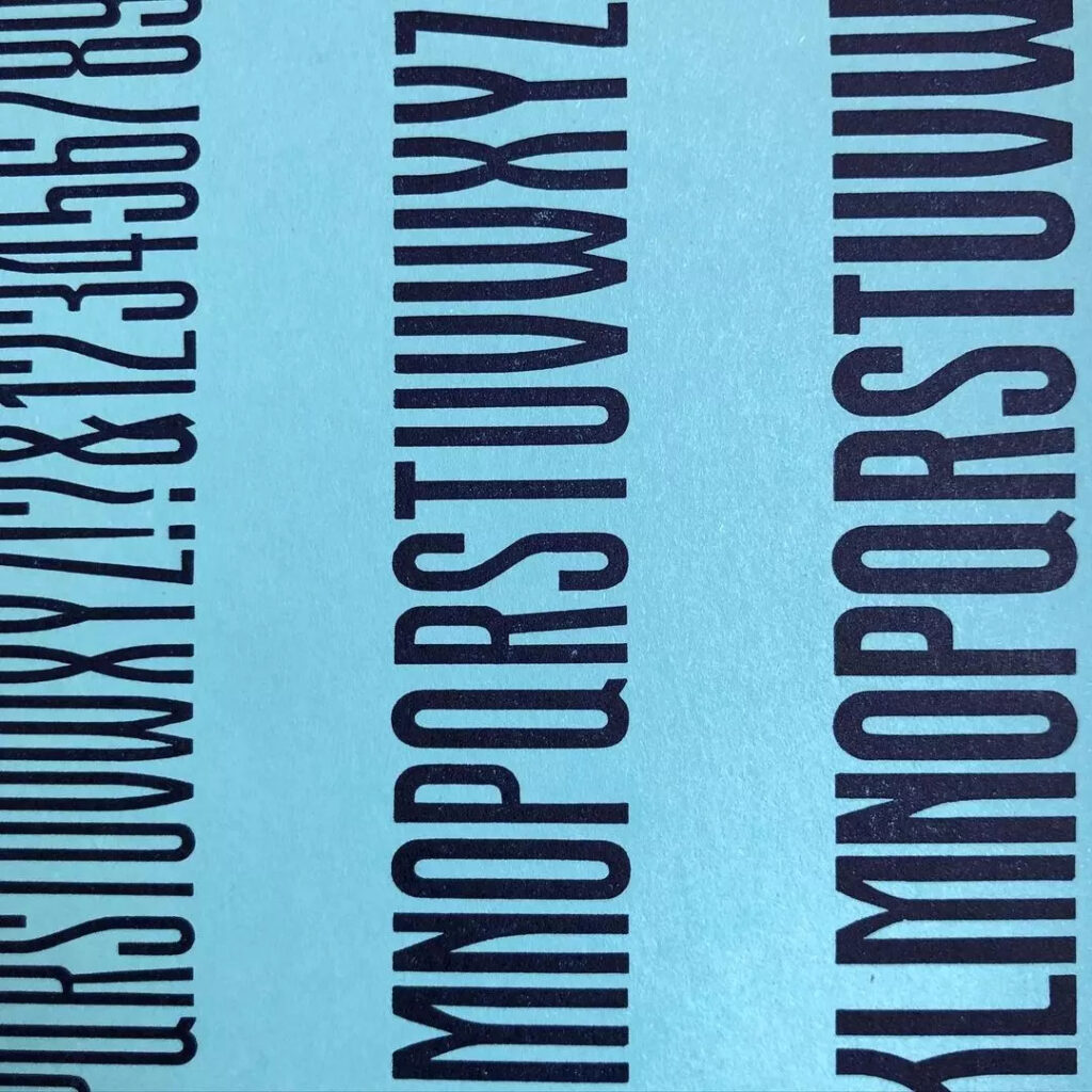
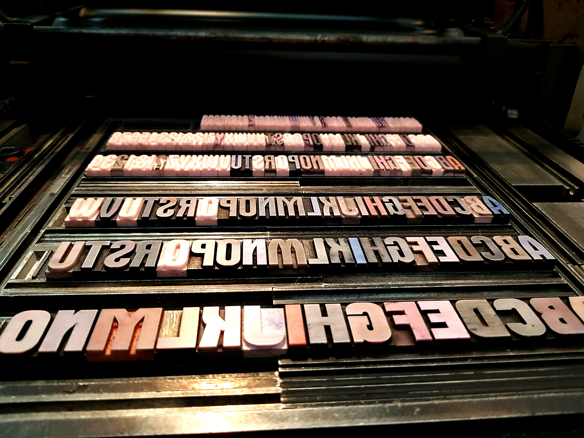
Sempre con l’idea di Spazio in mente, pensai a varie ipotesi da cui attingere e, alla fine, la più semplice si rivelò la migliore: ogni lettera usata come iniziale di un corpo celeste. Tutto il libretto è stampato in digitale, ovviamente, tranne le copertine interne, per cui ho usato sei pesi differenti, in plastica 5 pt, della Xilografia di Verona, un ponte fra passato e futuro.
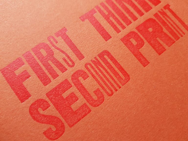
Il Galaxy non è un carattere dalla facile leggibilità – la timeline in fondo lo dimostra chiaramente – ma ha delle belle linee slanciate ed è ben bilanciato. Con poco spazio in orizzontale è perfetto.
Everyone involved in letterpress has undoubtedly come across the Aurora. Of German origin – the first version dates back to 1911 for the Wagner & Schmidt foundry – it spread throughout the European continent during the 20th century, apparently favouring Italy. Under licence or, simply, copied, it was melted by Fondografica around the 1920s and, probably from the same period, by Xilografia di Verona, in a multitude of weights and bodies. The names it took on over the years are also remarkable: from Inserat Grotesk schmal to Goliath, Imperator and Sirius. The latter, produced by Schriftguss in Leipzig, was accompanied by two other variants, Orion and Pallas, which together formed a small typographic constellation.
As I said, Italy was his adoptive home. Every printshop, whether large or small, kept in its drawers a few Aurora sets, almost always in wood. Narrow or wide bodies, sleek as missiles or as austere as funeral announcements. The versions are innumerable and multiplied with photocomposition and subsequent digitalization. It is not uncommon, in fact, to see the Aurora used in the signs of small shops.
The Xilografia di Verona also made plastic versions, probably towards the end of the letterpress era.
And now, the Galaxy has been added to the family. Its first use – actually the reason for its birth – was the 2021 Letterpress Workers book. On that occasion Fabrizio Falcone, with whom I was doing the book, made some ad hoc letters for the envelope, as tall as the envelope itself. As a good type designer, he continued with the project, making the entire alphabet, complete with numbers and some punctuation marks, and finally created the font. When it was time to decide on the name, the star declinations of Schriftguss came to mind and I suggested to call it Galaxy, to represent the completeness of the family and its launch into the future. In return, he asked me to design its specimen, content and design.
Always with the idea of Space in mind, I thought of various hypotheses to draw from and, in the end, the simplest turned out the best: each letter used as the initial of a celestial body. The whole booklet is digitally printed, of course, except for the inside covers, for which I used six different weights, in 5 pt plastic, from Xilografia di Verona, a bridge between past and future.
The Galaxy is not an easy-to-read typeface – the timeline at the bottom clearly shows this – but it has nice, sleek lines and is well balanced. With little horizontal space, it is perfect.